
White Balance
Remember when you were a kid a played Hide and Go Seek? Wondering around blindfolded, someone would yell “hot” or “cold”. For a long time, hot and cold struck fear into my heart when it came to colors. I was convinced that I was somehow genetically incapable of recognizing cool and warm tones.
Camera’s automatic modes are capable of automatically setting a white balance, even in priority or manual modes. However, learning to break out of this brings more control and freedom to one’s photography and will help overcome problematic situations. White balance can often be that ” something” that seems off in a photograph. Learning to control white balance takes some time and patience, but will pay off in the end. Although not absolutely required to set manually, if you choose to, I suggest doing it first before tackling the “golden triangle”.
Before we talk about camera settings, however, let’s discuss what white balance is. Most simply, white balance sets the temperature of the photograph. Temperature is the measure of light on a spectrum from warm to cool. Whoa, what? Let’s break it down.
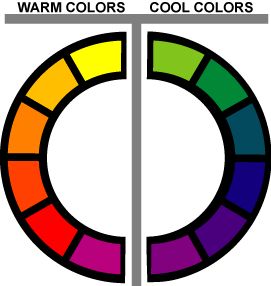
Cool tones
Cool colors are those associated with the sky and water. They are, therefore, blues and grays but also greens, purples, and violets that lay next to blue on the color wheel. For cool colors, think coastal landscapes, snowy mountains, and platinum blonds. Winter and summer months are cool months, so outdoor pictures during these months often tend to fall in cooler temperatures. (If you’re interested in the science side of this, click here to listen to a RadioLab that “blue” my mind!)
Warm Tones
Warm tones, on the other hand, are tones traditionally associated with the sun: reds, oranges, and yellows. Spring and fall photographs often lean towards warm tones, picking up on spring yellows and turning leaves. For warm tones, think fireplace scenes, golden sunsets, and fall foliage.
A light bulb goes off
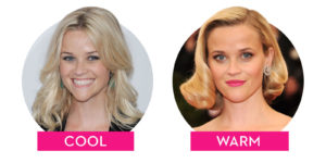
Temperature baffled me for a long time. When I first started photography, I was concerned when a professional photographer told me a picture I had taken was good but my daughter was blue. I initially worried that something was medically wrong with my daughter. But, what he meant was that the photo temperature was too cool; her skin was giving off a blue hue. Measured in kelvin, temperature indicates where a color lays on the spectrum between cool and warm.
This started to click for me when we replaced the light bulbs in our house with energy efficient LEDs. The first bulbs I brought home were “day light” measured at 6500 k. I had read somewhere that this would give noon-like sun light. and thought this would be good Instead, I got a blue tinted room that made me squint. Aircraft could have used my living room as a landing pad. My mother, however, uses a daylight bulb on her craft task lamp for sewing and reading because of the near white color it gives off. To me, it reminds me of older women who put blue in their hair to make it appear more white.

The next day we exchanged the day light bulbs for slightly cooler “cool white” bulbs. Rated at 4100 kelvin, these give off a more white light. that I find more neutral. While many of the pages I read suggested these for kitchen and baths and even warmer “soft white” bulbs for living rooms and bed rooms, I opted to stay with cool white lights throughout our house since it’s decorated in cooler tones throughout. (Some of the more high end LED smart bulbs out there allow you to adjust the temperature of the bulbs, but those were out of my budget!) Soft white bulbs are around 2300 kelvin and give off a red or yellowish hue. They are considered best for bedrooms and living rooms because of the calm and inviting environment they are said to create. This is when the metaphorical and literal light bulb went off for me. I finally started seeing cool and warm in my own photographs.
Setting Your White Balance: Step 1 to Manual Shooting
For photography, too cool photos will lead to your subjects taking on a bluish tone; photograph too warm and you

‘ll end up with pictures of umpa lumpas. Cool tones are where many photographers will gravitate for outdoor winter shoots when the sun is a little lower in the sky and grasses are often muted and tones. They’re also the natural choice for beach or pool shots. Warm tones are best for warmer months and fall when the sun bathes everything in warm light. It’s also where most indoor, casual photographs gravitate (just like the warmer light bulbs suggested for living areas).
All of this warmth and coolness is controlled by your white balance. In my DSLR Basics for Beginners I suggested starting with white balance before moving on to the “golden triangle” of ISO, shutter speed and aperture. Many photographers will talk about the golden triangle–shutter speed, ISO, and aperture–but white balance is independent of the triangle. As you bring in more or less light, the temperature of the photo will not be impacted just intensified. The white balance will tend to stay consistent during a photo session if you are staying in one location.
How To
So hopefully you’re beginning to understand the concept and importance of white balance, but how do you start to figure out what temperature to use? Luckily, most cameras come with several present temperatures handily labeled for different settings.

On my Sony a6000, the first white balance setting is marked “AWB” for automatic white balance. Honestly, until I was researching this post, I forgot this was even an option. Once I moved to manual shooting, I started always adjusting my white balance (or forgetting about it all together and getting some terrible pictures).
Your camera’s preset white balance temperatures may vary, but here’s a quick rundown. I find “daylight” and “shade” are straightforward choices and work well. My camera has “cloudy” and “incandescent“, but I can never find a setting in which these seem right. For indoor snapshots, I will usually revert to the preset cool white, just like my light bulbs. For me, warm white is usually too red and day white is usually too blue. My camera also have a few “fluorescent” settings that are supposed to compensate for fluorescent bulbs, but as florescent lighting becomes more of a rarity, I don’t find this setting as necessary. Most cameras will have manual color temperature/filter setting in which you can choose from a lighting and color spectrum, but I suspect this is reserved for some sort of color genius.
The custom white balance setting, however, is where you can make a huge impact relatively easily. This is not the same as manual. In the manual setting, you choose the temperature from a grid. In custom settings, you use a white card to set the white in balance. Simply select it from the white balance menu. Fill the circle on the screen with something white and click the center “set” or ok button to set the color and then press it again to confirm. Your white balance is set.
To set the white balance, you can use a white shirt, piece of paper, or these cards. Whenever I’m taking a more portrait-style shot, I’ll grab by 18% cards and hold them in front of my subject’s face quickly. Practice a few times and it really will only take a second to get a custom white balance every time.
In less than a minute, you can be up and running with a custom set white balance. Don’t be afraid to still play around with the custom suggestion. In summer months or with pale subjects, you may want to adjust your temperature to be a little warmer. Newborn babies, because of their slightly yellowish glow, may need a slightly more cool temperature to compensate.